About me
I’m Jeanne dRoue and I like to draw sexy things and comics. I have been doing non-sexy webcomics for a long while as John Wheel too. So you can call me either Jeanne o John. It doesn’t matter, both are pen names.
Since that was a little short and I like comics a lot, why not talk about how to make them? I can’t teach you how to be a comic artist, but I can point you in the right direction.
About making comics
You want to do comics? First thing you should know is that you don’t need to be good at drawing, but good at making comics. Both are very different skill sets and there aren’t many books explaining the difference or how to get good at making comics. Luckily we have Understanding Comics and Making comics by Scott McCloud which are incredibly good. The former explains how to read comics, why they are special and how to dissect them, while the latter builds on top of that and teaches you how to use it to make your own comics. Also, both are comics, so you get to see what is he talking about. Nice stuff.
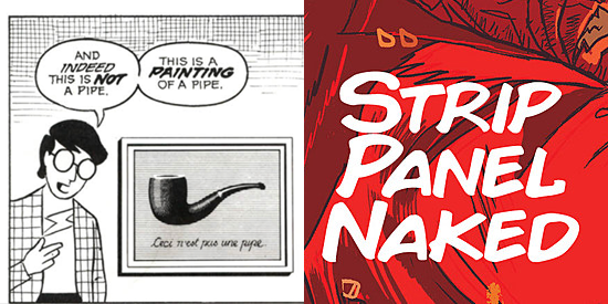
Don’t want to read? Check out Strip Panel Naked video series. They explain in detail how comics works using real examples from talented artists and don’t assume previous knowledge from the viewer.
Once you know how to analyze a comic, the best thing you could do is read lots of comics. Good ones, preferably. Even better if they toy with the medium. So here are some recommendations to learn from if you wanna read good stuff.
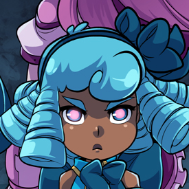
Sleepless Domain by Mary Cagle is an amazing webcomic about teenager girls forced to be adults dealing with depression and loss. Also, they’re magical girls and punch monsters and stuff. A word of caution: the first two chapters were written by Mary and drawn by Oskar Vega who is a great illustrator, but his comic skills were less than good. However, he stepped down and the webcomic has been drawn by Mary since then, and she’s great. She can tell a whole story just camera angles. Her layout and framing are top-notch and her colors are beautiful. She also pushes the boundaries of the medium from time to time. Mary is a fantastic comic author and there’s lots to learn from her.
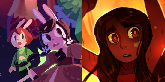
Since we’re talking about colors, if you want to know how coloring can improve and shape a comic look no further than Cucumber Quest by gigi d.g. and Ava’s Demon by Michelle Czajkowski (and another five colorists, which explains a lot, really). Cucumber Quest uses color to set tone and mood of scenes and communicate emotions, while Ava’s Demon uses color to distinguish and define characters. Superb work, both of them.
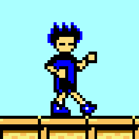
And since we’re talking about webcomics, Kid Radd by Dan Miller isn’t a webcomic, but the webcomic. It single-handedly defined what webcomics are about by making something that doesn’t resemble a comic at all. Kid Radd came out in 2002 and the closest anyone has got to be as revolutionary as it is Homestuck. The webcomic starts as a series of simple, silly, not-very-impressive jokes about old video games, but soon develops its own world and later becomes the greatest epic ever told with complex characters and a beautiful story. Kid Radd is to webcomics what Neverending Story is to literature.
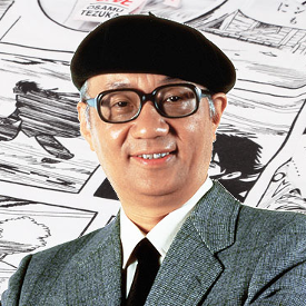
If you want to study good old classic comics, is hard to do better than Osamu Tezuka. He wrote stories about everything, so you’re bound to find something you like. Comedy, drama, fantasy, science fiction, you name it. He even had to create new genres, like magical girls! My favorite so far is Message to Adolf, a story about World War II and how hate destroyed people. It’s insane how his silly and funny style adapted so well to a story like that.
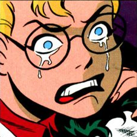
If you would rather read superhero comics, I’m fond of Mad Love by Paul Dini and Bruce Timm. The way the action and panels flow through the pages is pretty much perfect, and the colors are so simple yet so effective. This was the comic that introduces Harley Quinn and tells a story of domestic abuse from the point of view of a brainwashed victim.
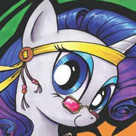
For a more cartoony approach I would suggest How Rarity got her groovy back by Katie Cook, Andy Price and Heather Breckel. The colors, the bodies, the expressions, the layout, the action, everything is so alive and dynamic and extravagant that it’s a wonder the characters don’t jump out of the page. Any of the My Little Pony comics done by Katie and Andy is good, but How Rarity got her groovy back is a standalone issue, so it’s easier to get in.
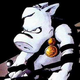
There is, of course, Cerebus the Aardvark by Dave Sim. This comic is a six thousand pages epic and nothing sort of masterwork. It can be used as an encyclopedia about what can be done on comics. But it can be used as an example about what not to do, too. You see, Dave Sim is a misogynist. Not your casual garden-variety sexist, no. He described women as creatures incapable of intellectual process that can only breed and then made up his own religion to prove it. Later he challenged Jeff Smith of Bone fame to a boxing match to, somehow, prove he isn’t sexist, because that’s what sane people do. So, yes, this stuff creeps in eventually, but there’s plenty of good stuff to take from Cerebus. Jaka’s Story is the best of the best, and Church & State is not half bad either. If you just want to take a peek instead of reading whole arcs you can check Mind Games I, II and IV to see how far you can go breaking every single rule about panels and gutters.
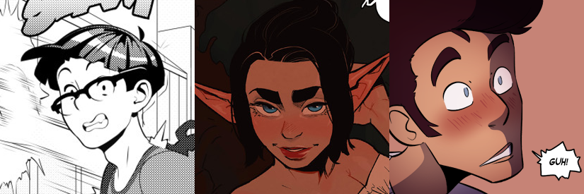
“But where is the sexy stuff?”, you may say. Well, I think you can learn how flow, layout and composition work from any comic, but some examples about how to do erotic comics wouldn’t hurt. Check Hot Shit High by Erotibot, Alfie by InCase and The Rock Cocks by Brad and Leslie. All of them have excellent drawings, but more importantly, all of them have excellent pages and each of them have different visual narrative styles. Also, turns out porn can have a plot. Who knew, huh?
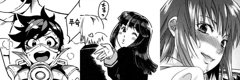
Do you prefer doujins? Check Overtime!! by Hirame and Abi Kamesennin. Every single drawing moves on their own and most of the time doesn’t bother making the gutters letting the panels mix together, or even drawing some panels on top of others. The thing is, it works! It’s like magic!
It has been ages since I’ve read something by Yamatogawa or Yuzuki N Dash, but Aqua Bless by Yamatogawa does a lot of interesting things and Yuzuki N Dash was cool in general. You can go wrong with them, they’re pretty good even at their worst.
Overall, if you want to be a comic artist you should read a lot of comics, and you should read different comics done by different artists for different people. Thing is, there isn’t a right way to do comics, but by looking at what other people did it’ll be easier for you to find your own way.
Just look at my list. There’s Neon Genesis Evangelion for girls, a sprite-comic done with HTML, an anti-war historical drama, silly ponies for kids and exhibitionist musicians among other things. Take a hint. The hint being that Dave Sim is an idiot.
About drawing
Now, even if drawing comics is not the same as drawing pictures, you should be able to draw a little, so here are some resources.
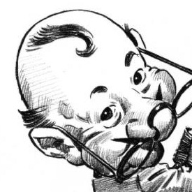
Fun with a pencil by Andrew Loomis is the perfect book to start. Loomis was both a marvelous illustrator and a good teacher. This book assumes you have never drawn before and teaches you how to draw. Not how to draw X or how to draw in X style or how to draw this or that. He teaches you how to draw, period, so once you are done you can draw whatever you want however you want and take on more complex subjects.
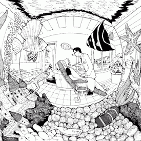
Perspective! For Comic Book Artists by David Chelsea talks about, well, how to do perspective. Just like Understanding Comics and Making Comics it’s a comic chock-full of examples and little jokes and Chelsea is so good at perspective it’s almost unreal.
To learn about color theory… The best explanation I’ve seen was a slide show. Made in Flash. On deviantArt. And got deleted. I’m sorry. But you can check Cubesona’s tutorial about the fundamentals of colors (Part 1 and Part 2). It’s short, it’s fun and the guy knows his colors.

Line of Action is a useful website to either warm-up before a drawing session, draw from natural or learn about gesture drawing and how to draw more natural poses.
About software
I’m a GNU/Linux user that avoids non-free (as in freedom) software as a matter of principle, so don’t expect me to recommend closed proprietary applications. Anyway, this is what I use:

krita First time I tried it I didn’t like it at all, now is my favorite. It’s designed for digital drawings, which means it has hundreds of options, so it may take a while to get used to. Which is true for most drawing applications, so there. Licensed under GPLv3.
mypaint is designed to be as simple as possible and to imitate traditional techniques as closely as possible. That means two things: it’s incredibly lightweight and lacks a lot of common tools like selections. It’s infinite canvas function and easiness make it a wonderful tool for doodling and sketching, but can be a little cumbersome for complex pieces of work. Story time: Once I spent forty minutes making thirty seconds sketches without being aware of how big the drawing was. mypaint handled it like a champ and without slowdowns, every other program had trouble even trying to open it. Licensed under GPLv2 or later.
gimp is designed for image manipulation, not drawing, so sketching and inking isn’t very pleasant. However, the 2.10 version added mypaint brush engine and let you rotate the canvas, so that may be no longer the case. I’m still using it for resizing, cropping, tuning up levels and because I’m used to its workflow for lettering and I don’t like too much how krita handles text. Licensed under GPLv3+

jekyll is the static site generator I used to make this site. It’s simple and good enough for a small site as long as you don’t want to add too many features to it. It ships a web server for local development so you don’t have to install and configure apache or nginx just to edit some posts and check your CSS, which is nice. Licensed under MIT.

bootstrap is the CSS framework I used. It’s developed by Twitter, has helper classes to make the design mobile friendly without having to sacrifice a goat and adds a lot of custom components to make it look like, well, Twitter. If you ever wondered why half the websites look the same, this is the answer. The defaults look okay, but you are supposed to add your own things if you want to make the desing pop. Licensed under MIT.
And there, we’re done. You can go on your way to be a comic artist. Just, please, whatever you do, please, don’t punch Jeff Smith.
The images used in this text belong to their respective owners.
